


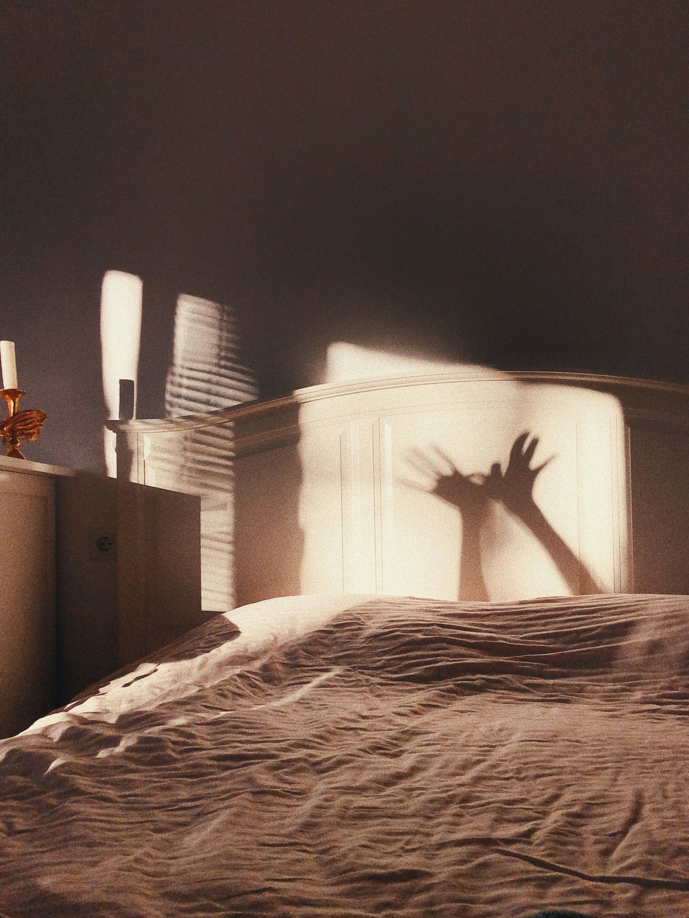
Problem Statement
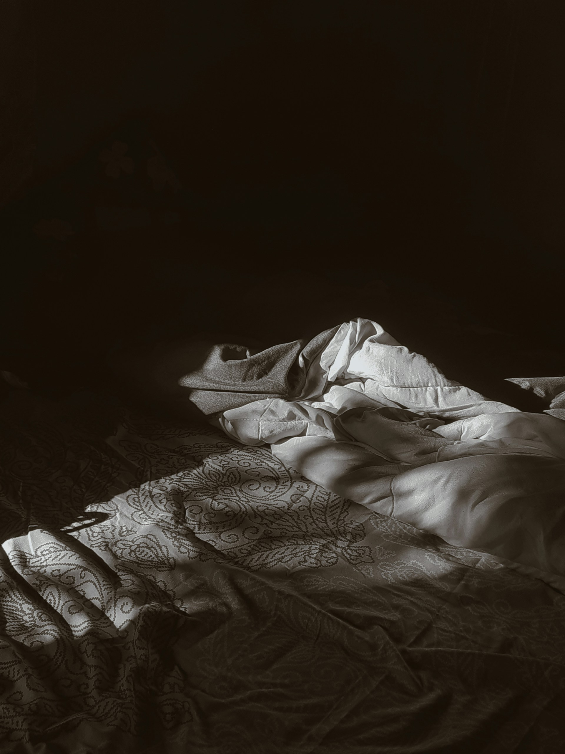
Everyone sleeps differently, and many people use auditory sleep aids, commonly called white noise. Often, sleep apps lack personalization, which can limit their effectiveness. Integrating personalized features can better address individual sleep needs and improve user satisfaction. Over the years, the Sleep app within the Health app has received only a few updates. I propose expanding the Sleep app into a standalone app to enhance the user experience significantly.
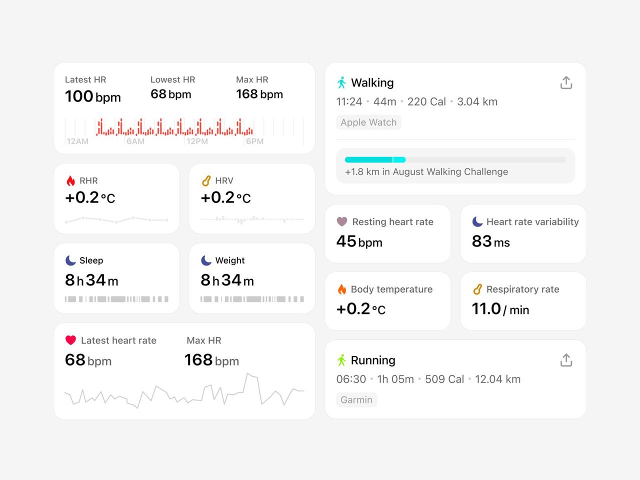
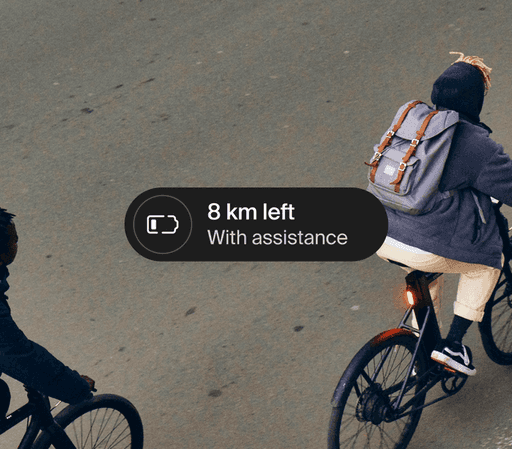
Currently, iOS has sleep features spread across different apps and system functions. For example, in the Health app, users can access their sleep health data, but are often referred to other sleep apps for additional features that may be beneficial. Integrating these features into a unified, standalone sleep app would improve user engagement by providing a seamless experience that leverages existing iOS capabilities, such as background sounds in the Control Center and meditation options in the Fitness app.
My primary design rationale throughout this is that the tools and components necessary for a comprehensive sleep app are already integrated into iOS; all that is needed is a way to bring them together to create an essential application within the iOS environment. Many sleep apps today offer a one-size-fits-all experience, lack customization, and deliver repetitive content, which diminishes their effectiveness over time. By developing a dedicated sleep app that offers tailored features and personalized content, it can better meet user needs and encourage adoption, overcoming limitations imposed by paywalls and generic solutions.
Solution Statement
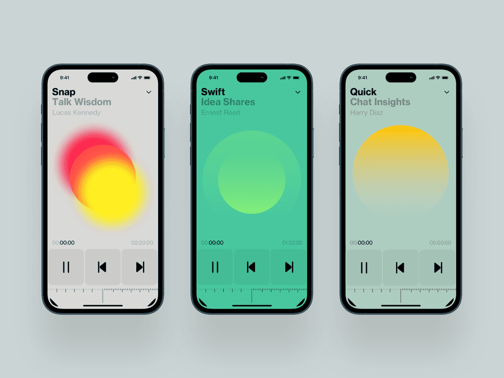
Developing a native application that enables users to create personalized sleep experiences based on their unique sleep needs and preferences. Incorporating sleep aids into existing devices and software for easy access in nightly routines. Offering a variety of sleep sounds with options for specific narrators and evolving content to prevent habituation and maintain effectiveness.
Research Insights
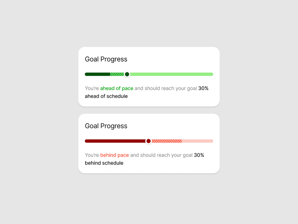
Many Americans are increasingly interested in tracking and understanding their sleep habits to improve their sleep quality, often using wearable devices or mobile apps. A 2023 survey by the American Academy of Sleep Medicine highlights that over one-third of Americans (35%) have used an electronic sleep-tracking device, showing growing engagement in sleep monitoring. A majority of those who have tried one found the sleep tracker was helpful (77%), and many have changed their behaviour because of what they learned (68%) (Link)
Additionally, a study published in Frontiers in Neurology found that white noise can help people fall asleep 38% faster compared to complete silence, highlighting a simple method to improve sleep onset.
Survey Findings
The target audience is young adults (19-35 years) living in major North American cities who primarily use in-ear headphones and are seeking auditory solutions for stress relief and sleep enhancement.
Users tend to prefer customizable, natural ambient sounds over generic white noise, indicating a desire for authentic relaxation options that resonate with their natural environment. Primary usage occurs during times of stress and at night, indicating that audio solutions serve dual purposes for relaxation and sleep, which can inform research on user routines and preferences. Interestingly, one participant noted using “the steady hum of a fan or air conditioner,” highlighting how incorporating familiar household sounds can enhance relaxation and sleep routines.
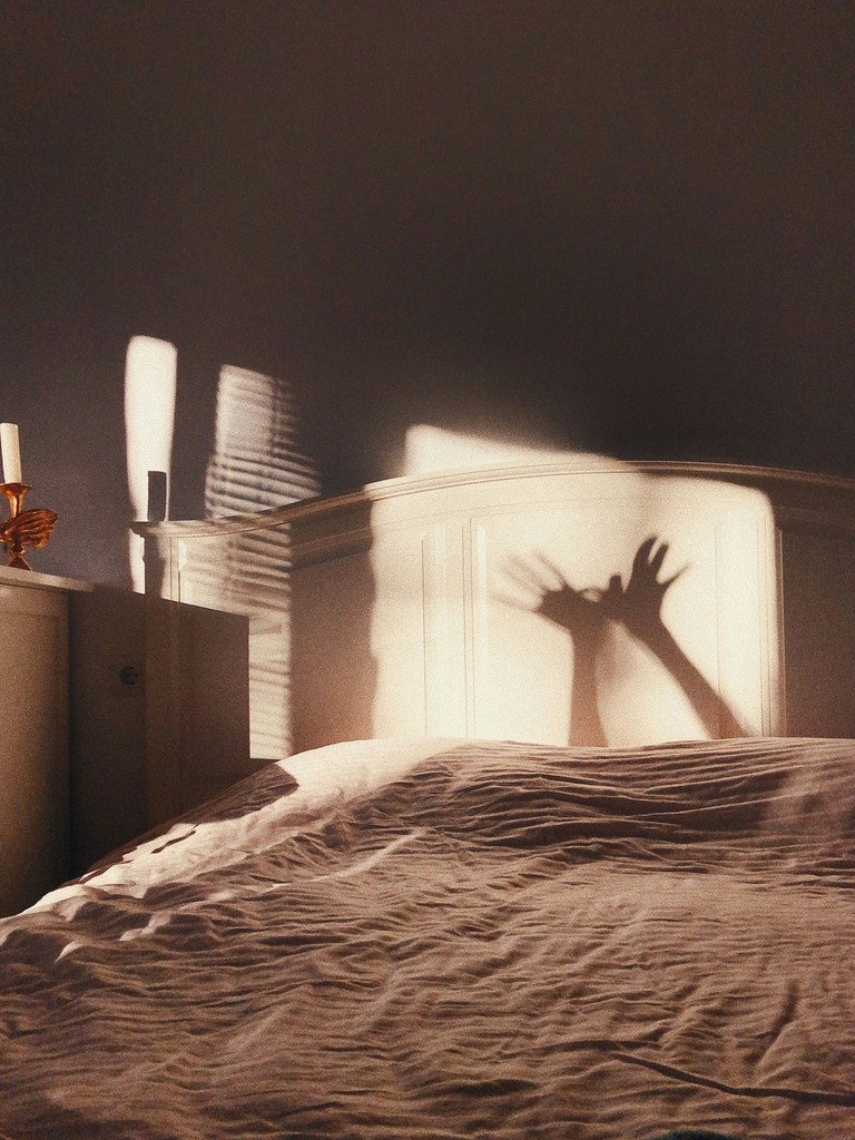
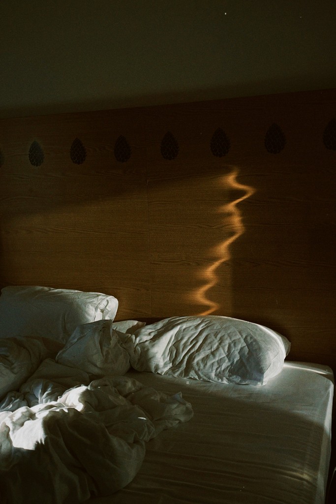
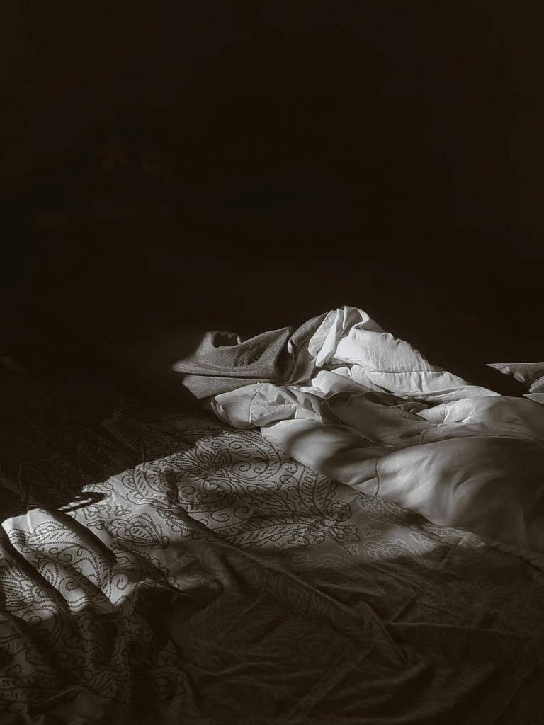
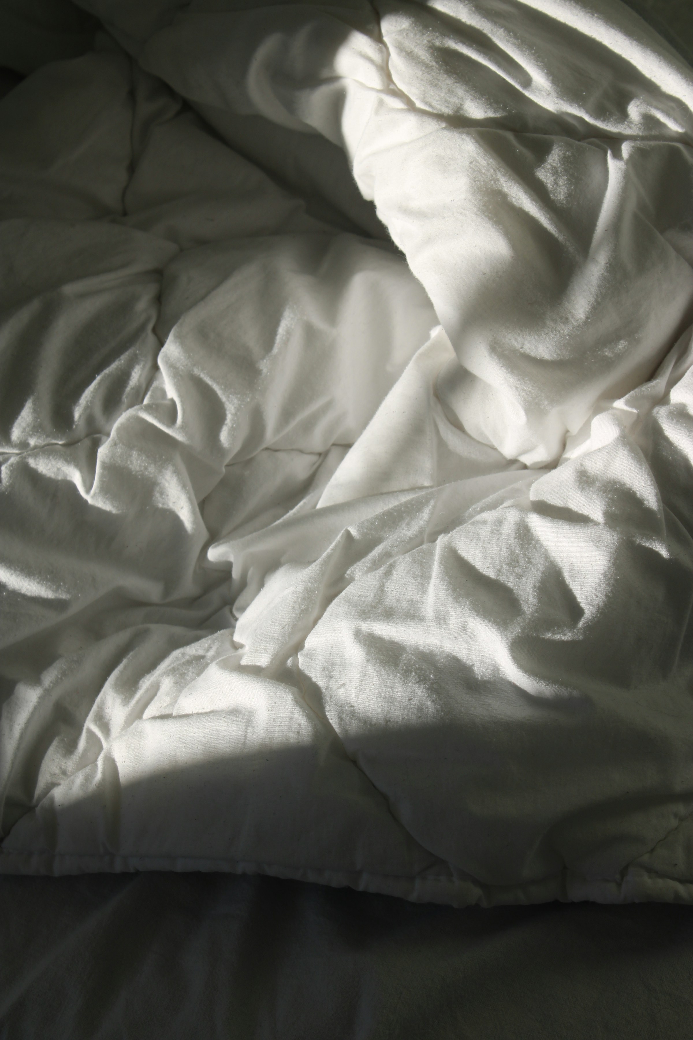
Moodboard


Concept and Creation
While many sleep apps exist, developing a dedicated native sleep app would better serve user health and demonstrate Apple’s commitment to well-being.
The Sleep feature in Apple’s Health app has not undergone significant development despite several iOS updates, highlighting a stagnation that presents a valuable opportunity for innovation. I propose transforming this functionality into a dedicated native application that could subtly yet powerfully impact users’ sleep patterns and overall health.
Over several iOS updates, the Sleep functionality within the Health app has seen only minimal enhancements. This indicates a significant opportunity for improvement. I propose expanding this feature into a standalone native application, as I believe it could positively impact users’ sleep habits and overall well-being. By allocating more resources and focus to sleep tracking and assistance, a more comprehensive, user-friendly tool that seamlessly integrates with the iOS ecosystem while offering advanced features tailored to individual sleep needs can be created.
This app could position Apple as a leader in sleep health, inspiring confidence in the audience about Apple’s innovative role in improving users’ daily lives.
User Personas
To better understand the diverse needs and preferences of individuals seeking sleep aids, I conducted thorough user research and analysis. This in-depth approach yielded two detailed user personas, each representing distinct sleep patterns, challenges, and goals.
Early Iterations/Sketches
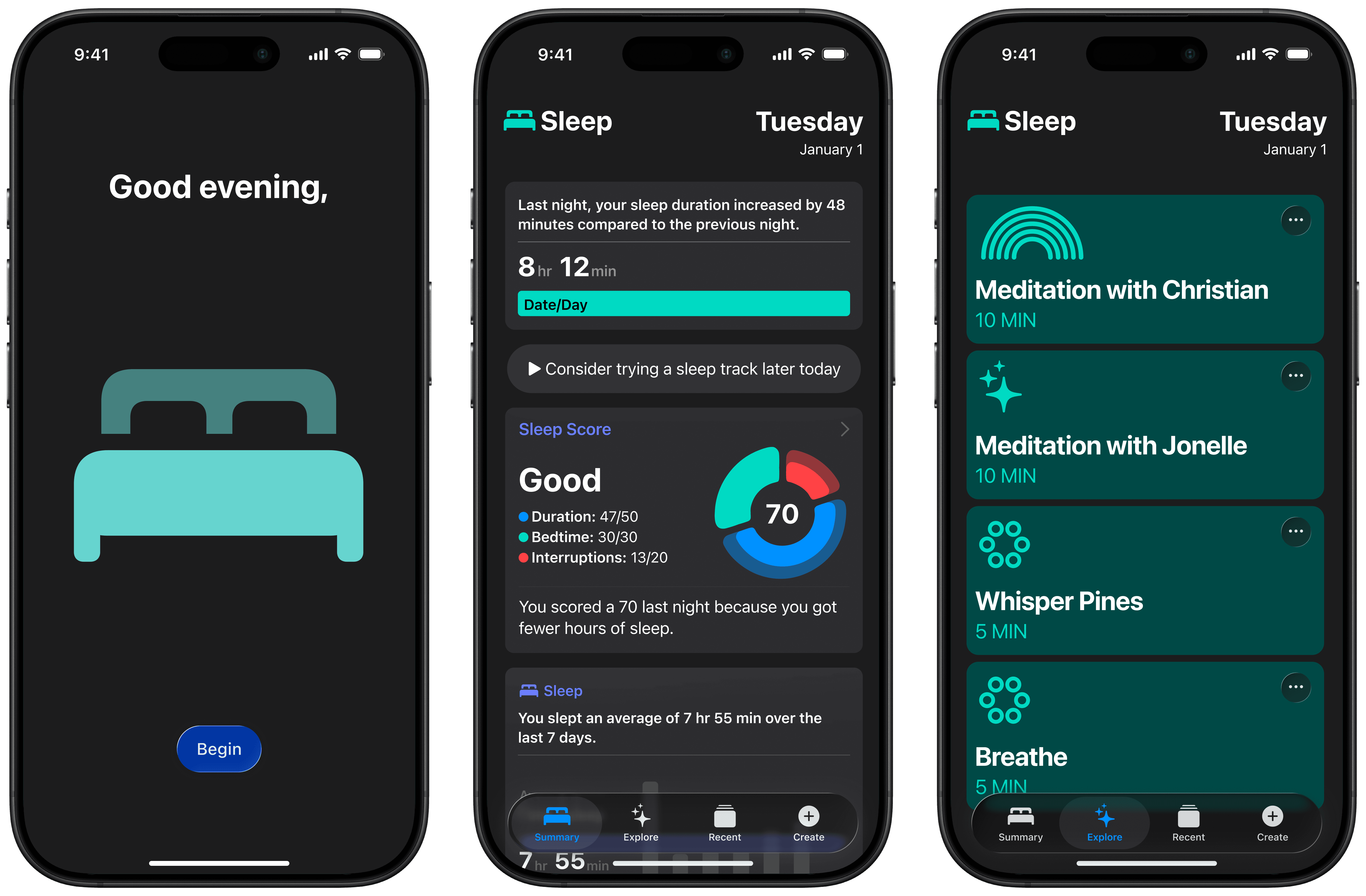
In my initial sketches, I focused on outlining a user’s typical bedtime routine and the actions they may take. From the beginning, I wanted to incorporate customization features while ensuring the app’s design seamlessly aligned with iOS’s colour schemes, typefaces, and layouts, which is crucial for a smooth user experience. Although this is intended to be a standalone app, I aimed to create an experience that doesn’t feel like an external add-on. My goal was to develop an app that is as intuitive as the pre-installed iOS applications, positioning it as another valuable tool within the phone’s ecosystem.

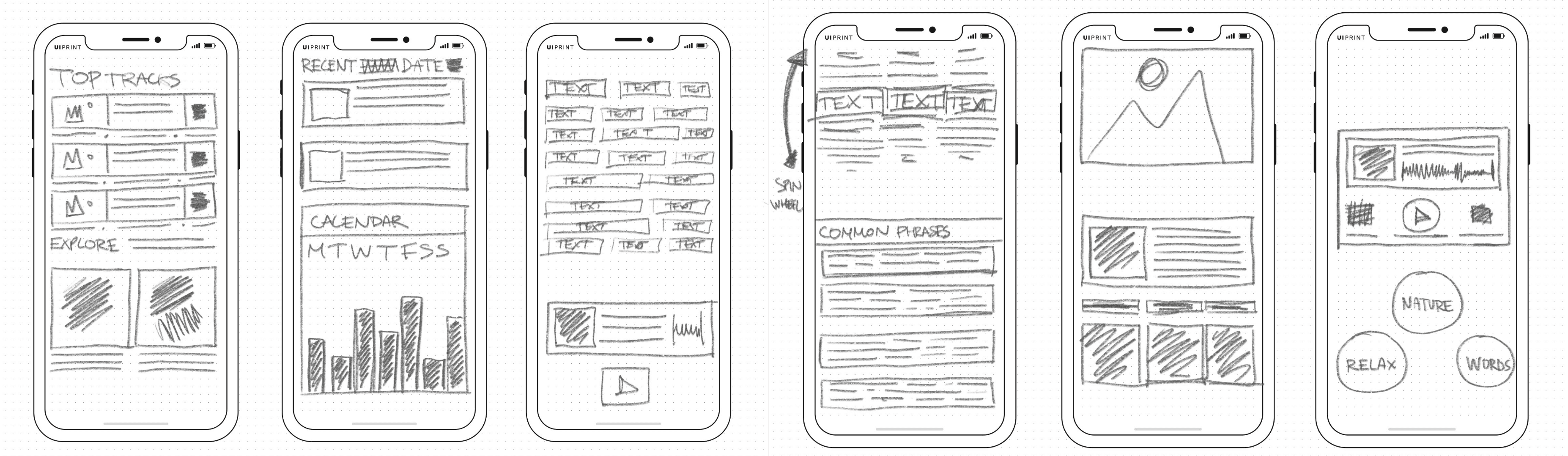
From sketches to wireframes, it was incredibly informative to continually assess which elements would be most beneficial to the user. For this project’s wireframes, I focused on functionality and aimed to understand how the user flow might be structured, considering the dynamics of preparing for bed and falling asleep. My goal was to distill the process to its “bare essentials,” being thoughtful about every potential touchpoint involved in getting someone ready for sleep.
User Flows
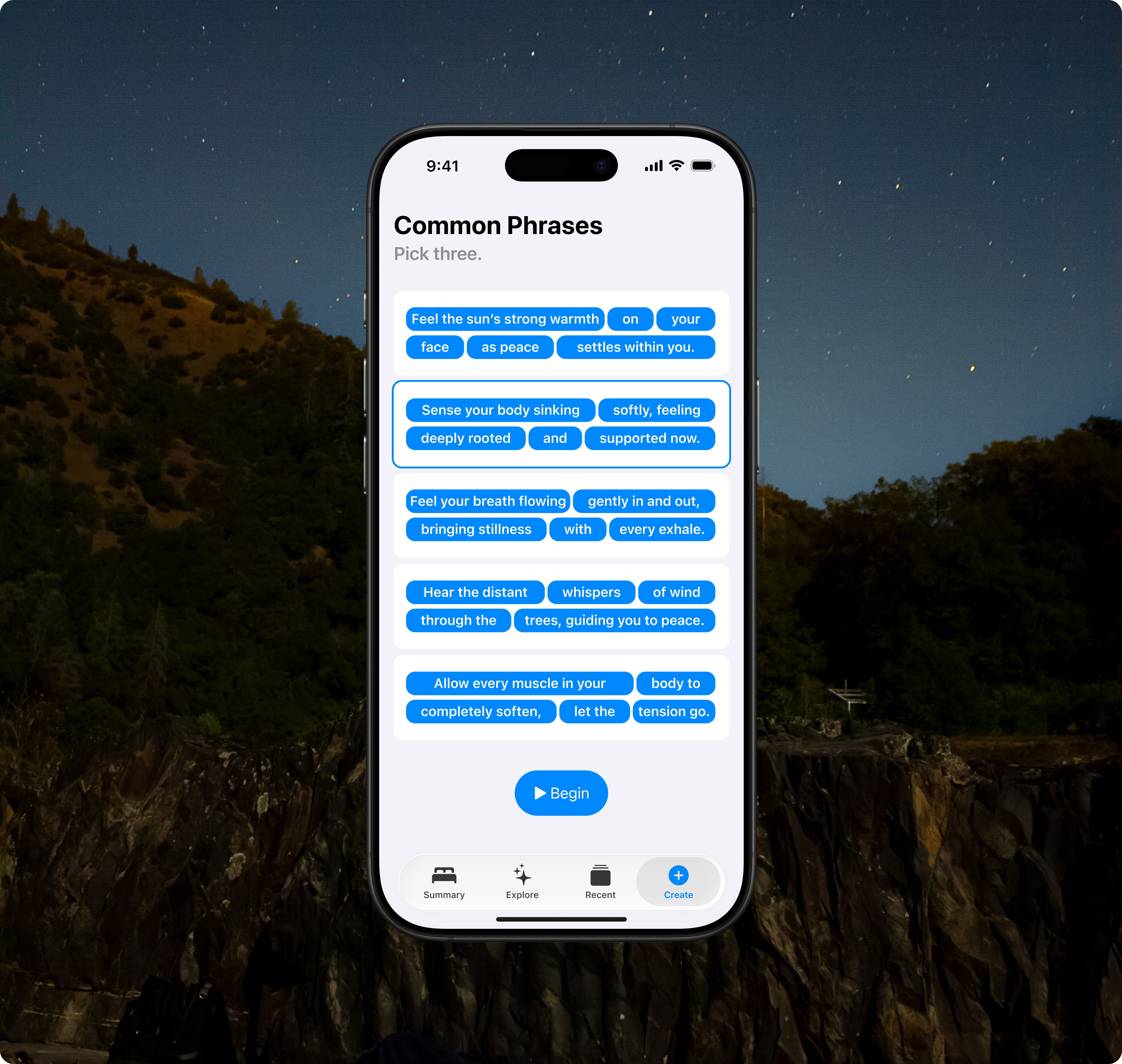
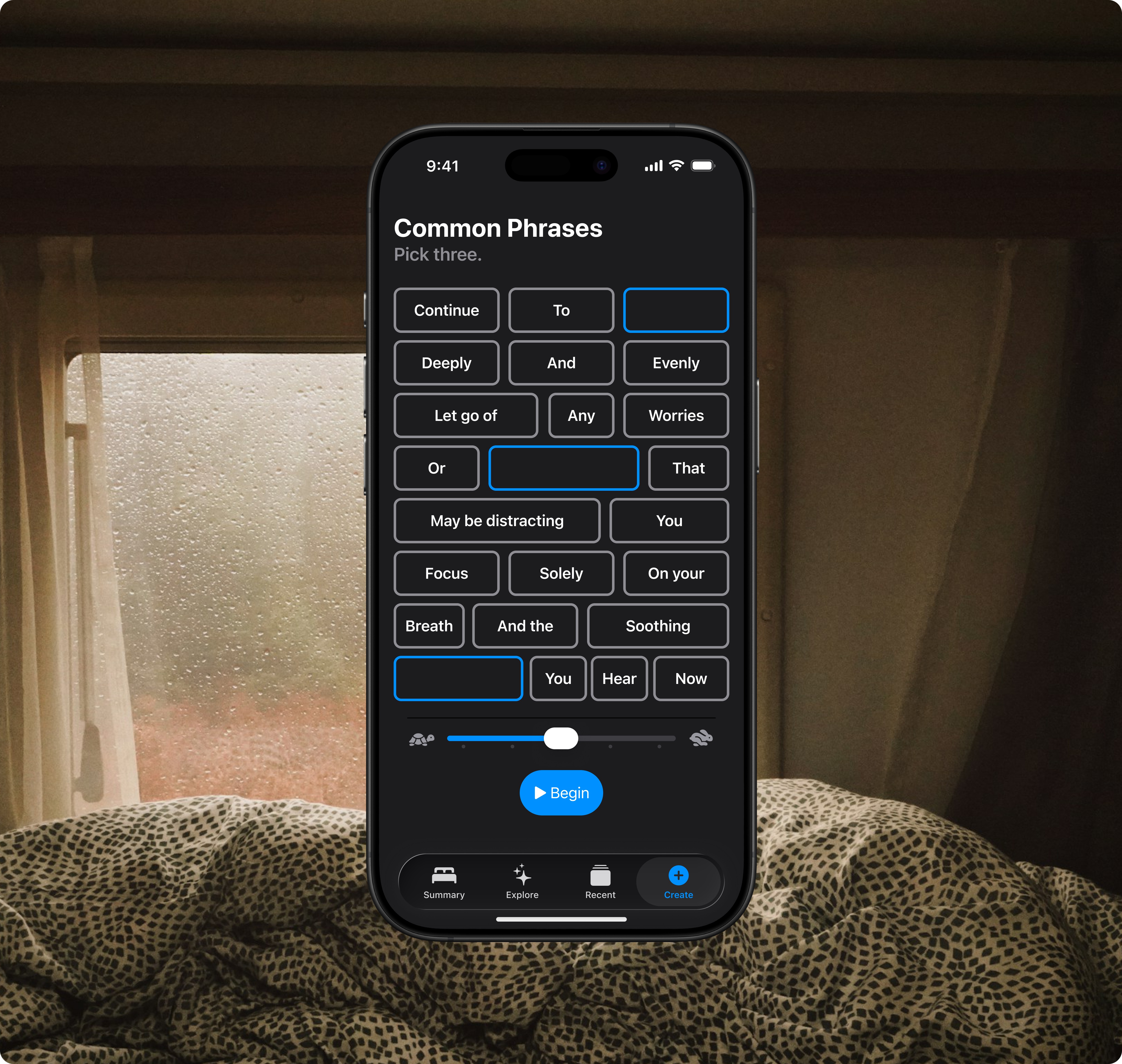
The main goal of creating this user flow was to understand users’ needs and outline the key steps in a typical bedtime routine while carefully analyzing each possible interaction point. This thorough approach enabled us to design a sleep aid application that seamlessly fits into users’ nightly habits, effectively meeting their needs at every stage of the pre-sleep process. By breaking down the bedtime routine into its essential components, we identified key moments where the app could offer value. These include the wind-down period, the selection of a sleep track, and the moments when users settle into bed. This detailed analysis ensured that we did not overlook any crucial touchpoints that could enhance the overall sleep experience.
Wireframes
The shift from initial sketches to refined wireframes was enlightening and provided valuable insights into the project’s development. This process allowed me to assess and enhance elements that would deliver the most value to users, helping me identify essential features and those that could be streamlined or removed.
While developing the wireframes for this sleep-focused application, I prioritized functionality and user experience. My main objective was to create a logical, intuitive user flow that guides individuals seamlessly through their bedtime routine. I carefully considered each stage of sleep preparation, from winding down to falling asleep, ensuring that every step was incorporated into the app’s structure. This user-centric approach allowed me to design an interface that not only met functional requirements but also aligned with the natural rhythms and habits of our target audience.
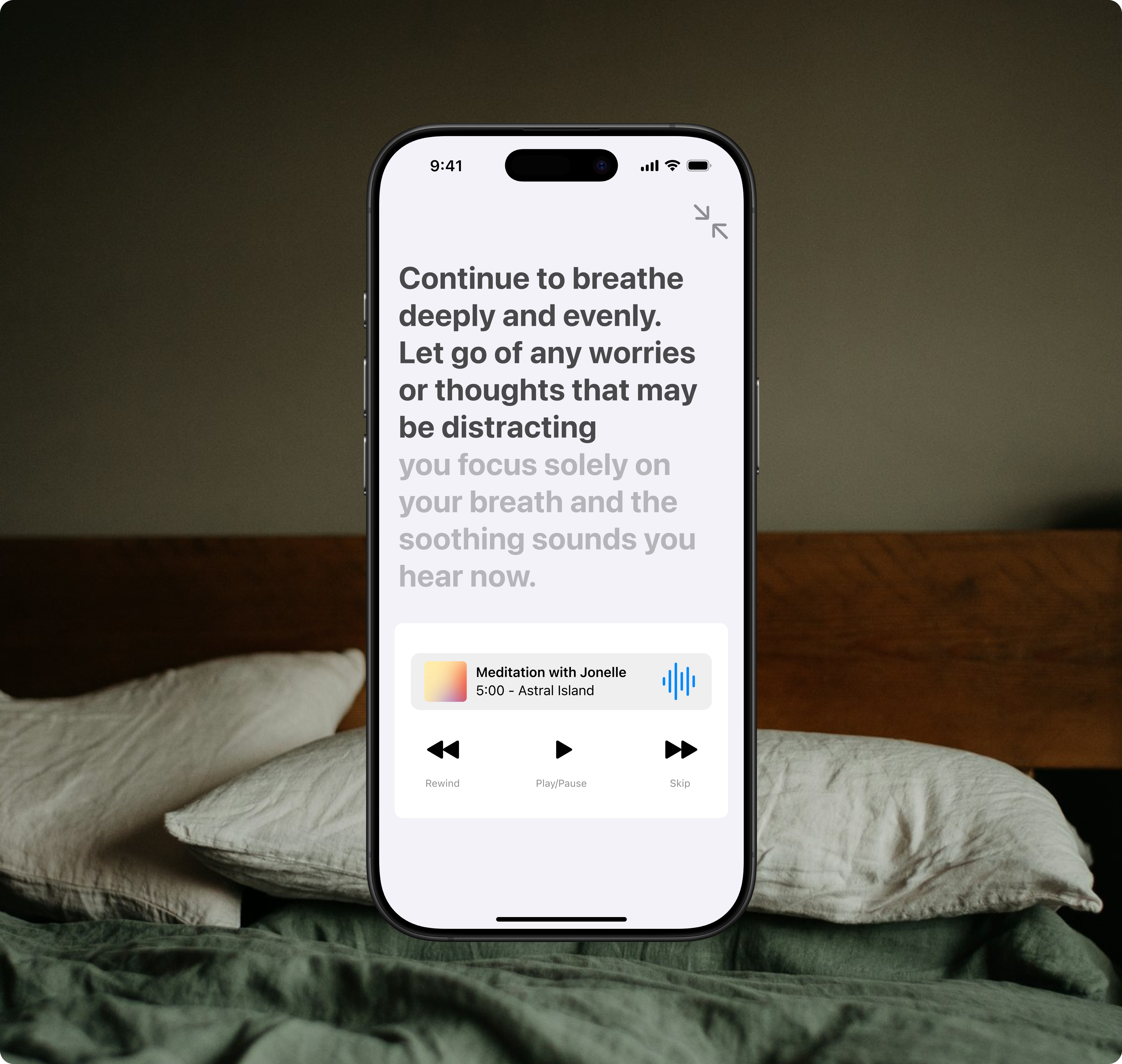
The proposed iOS sleep app design demonstrates how it could be effectively utilized. While still preliminary, it aims to inspire confidence that the app will become a helpful tool, seamlessly integrating into bedtime routines to enhance sleep quality for diverse users.
Branding
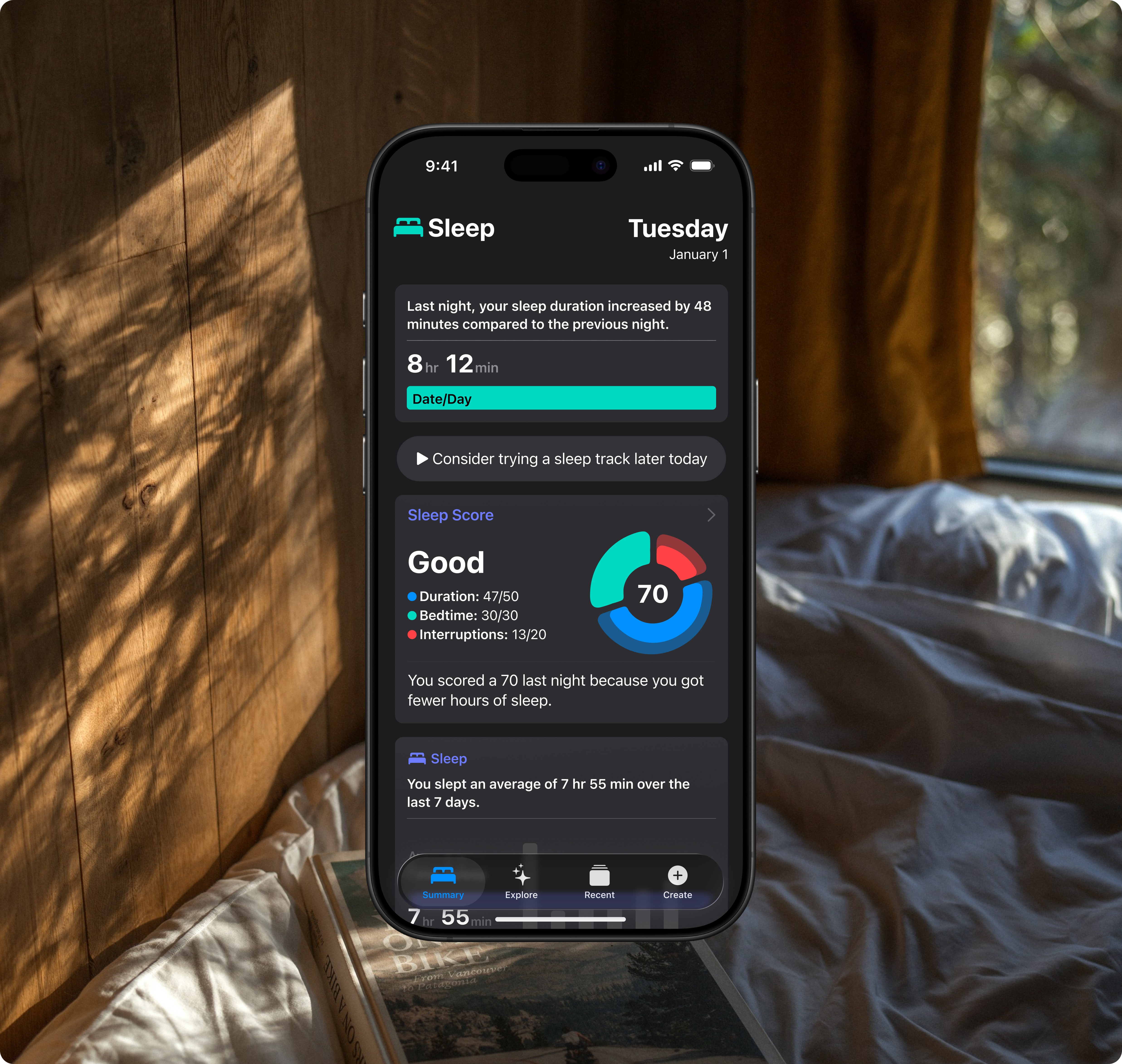
Incorporating familiar colours and design elements from the sleep interface of the Health iOS app helps users feel confident and comfortable, fostering trust in the app’s seamless integration within the iOS ecosystem.
By maintaining consistency across Apple’s native applications, we reduce the learning curve for users, enabling them to adapt to the new sleep-focused features quickly. The established design elements and colour palette serve as visual anchors, reinforcing the app’s purpose and its connection to existing health and wellness features in iOS.
App Icon
The sleep icon is commonly used across the iOS ecosystem, particularly in the Do Not Disturb feature. This would be a recognizable icon to integrate into the app design.
Colours
To create a seamless, familiar user experience, I used the iOS 26 Figma kit’s colour palette. This ensures that the UI and overall aesthetics are incredibly cohesive and easily recognizable as a native iOS application.
Typography
I used Apple’s San Francisco (SF) typeface and iOS 26 Text Styles in the app design to create a cohesive look and enhance familiarity. Since SF is the system font for iOS, macOS, and watchOS, it integrates well with the Apple ecosystem. This choice not only ensures visual consistency but also enhances legibility, which is crucial for a sleep-focused app used in low-light conditions.
Creating interactive prototype in Rive
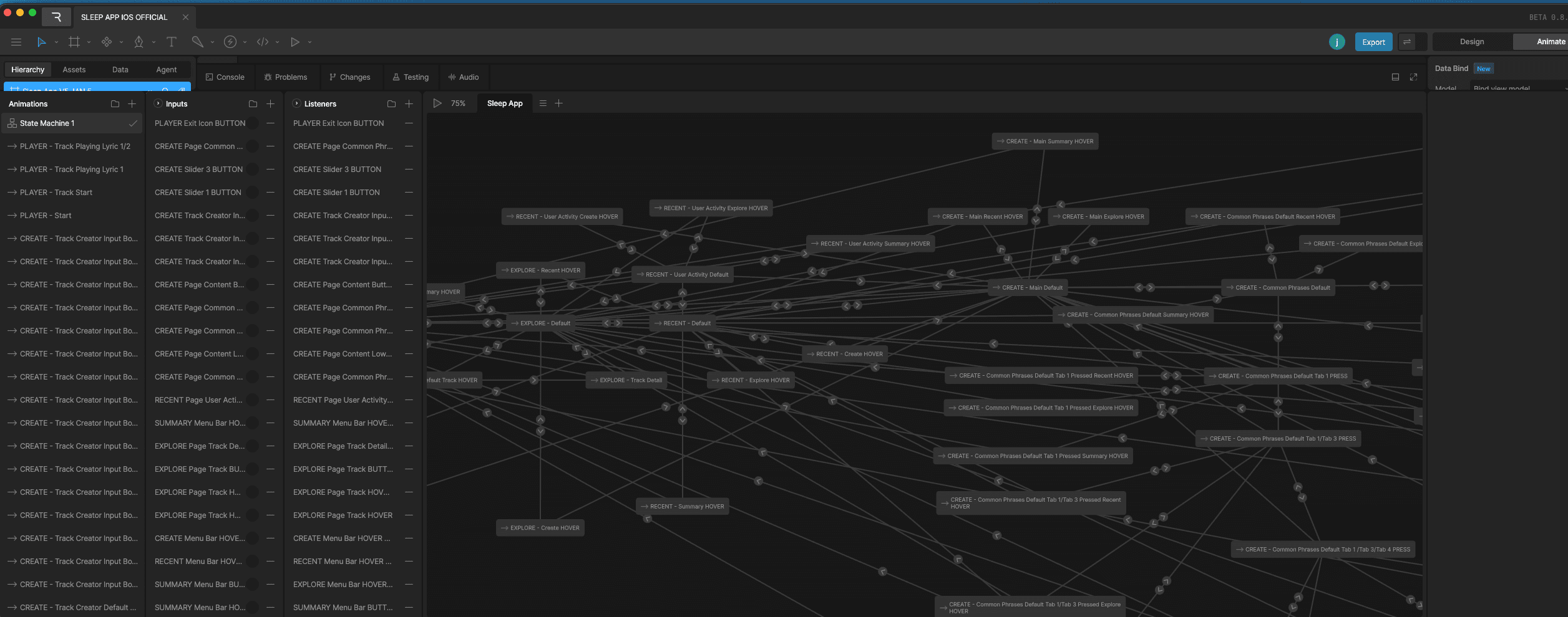

I built an interactive prototype using Rive, a state machine-based design tool that excels at high-fidelity graphics and dynamic prototyping. The prototype is embedded directly into this site.


Design System
I created a component-based design system using the iOS 26 Figma Kit to enhance the design process and maintain consistency throughout the app. This approach offers users a cohesive and easily recognizable experience across all components and interactions.
This project was designed as an extension of existing iOS features, so I focused on maintaining consistency with established iOS design principles. I carefully aligned the app’s visual elements, interaction patterns, and overall user experience with the current iOS ecosystem. My goal was to create a seamless integration that would feel like a natural part of the iOS environment, rather than a separate, standalone application.
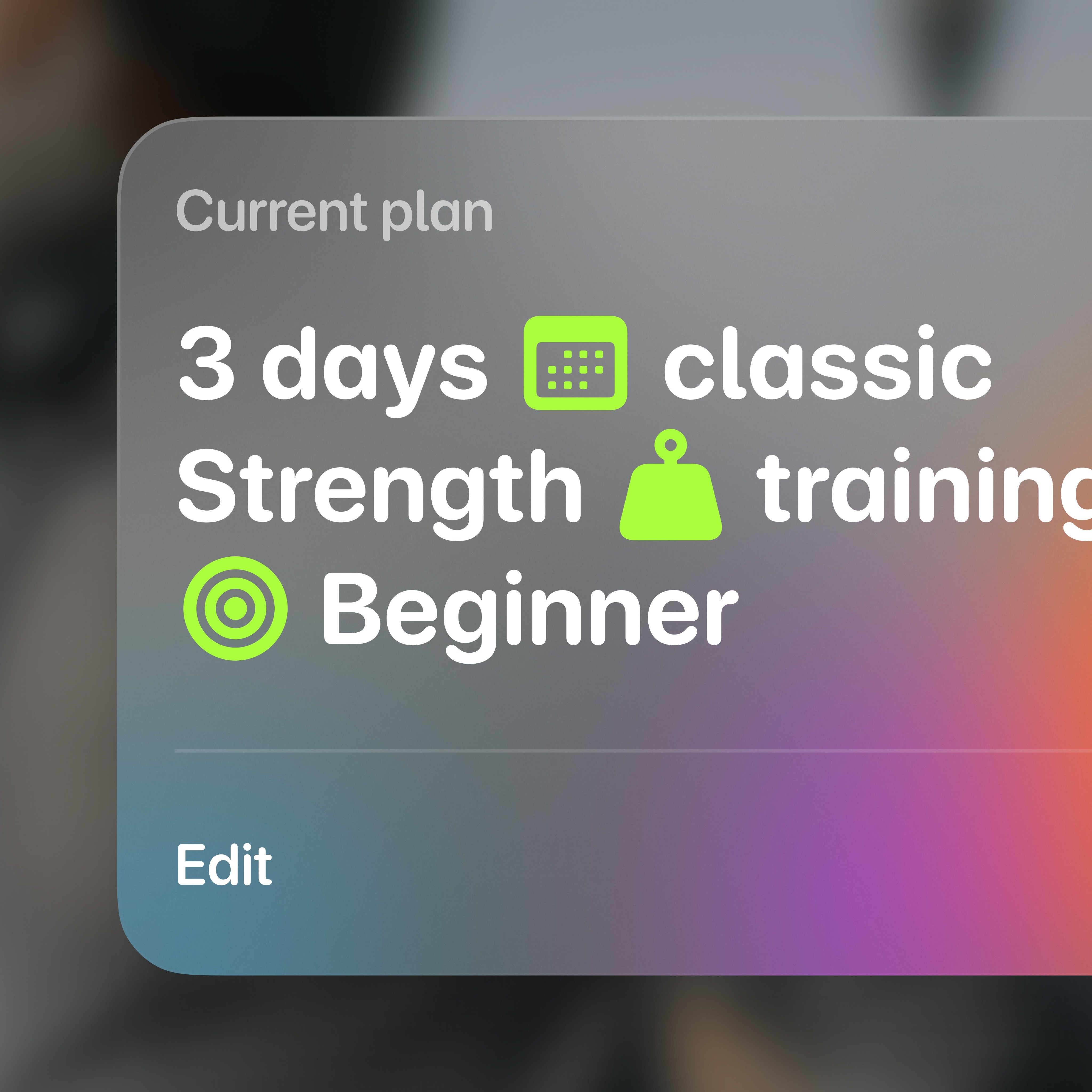
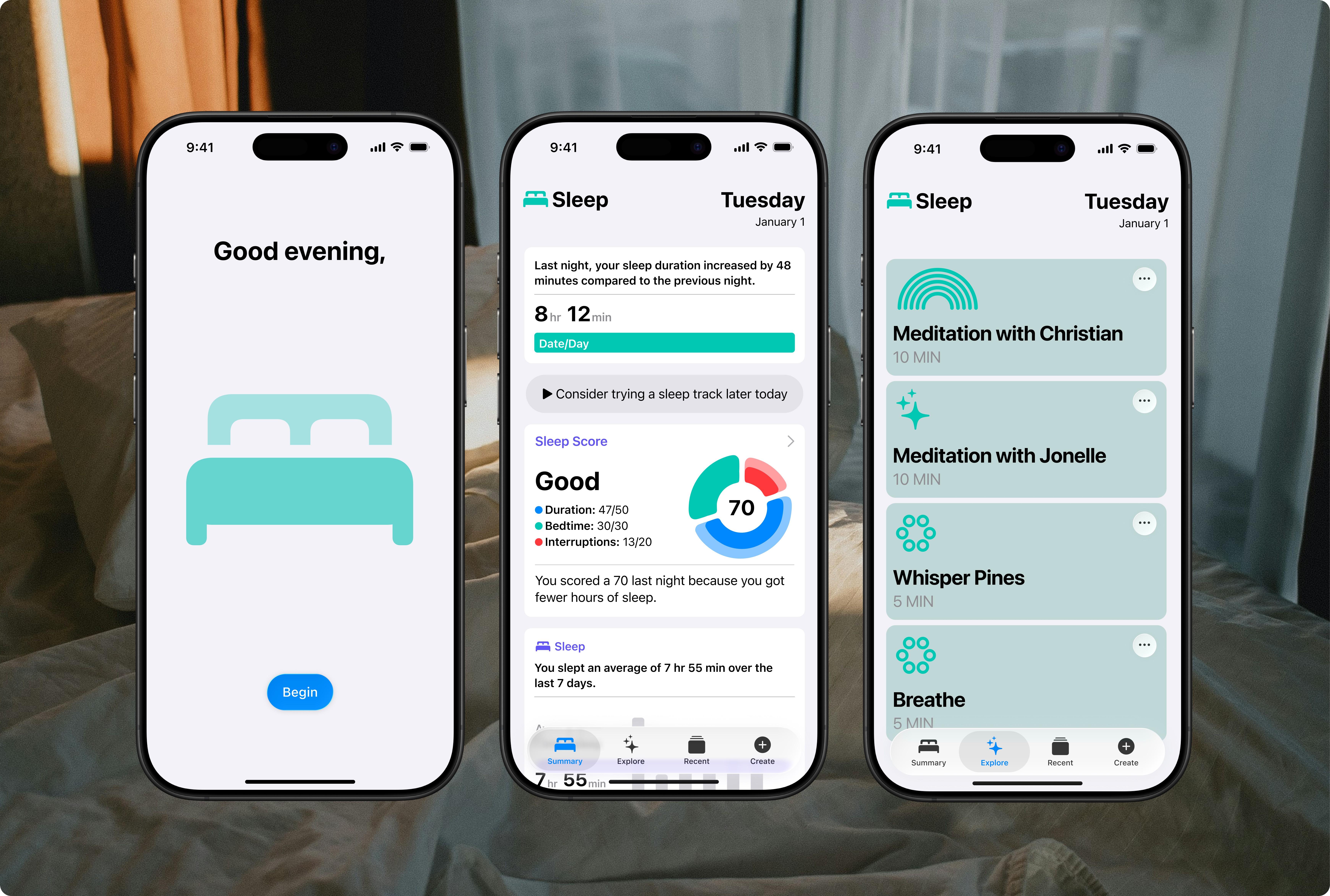
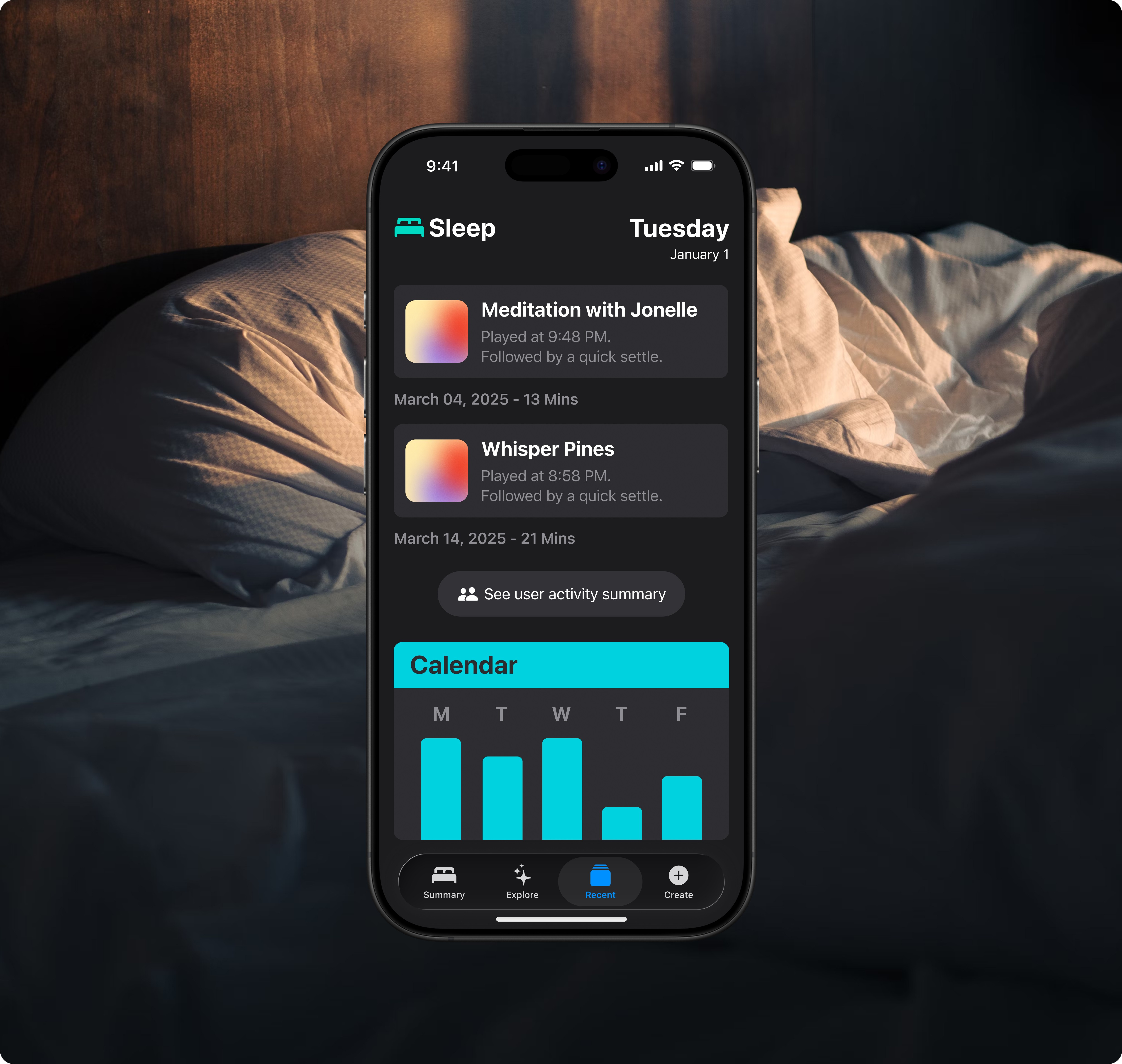
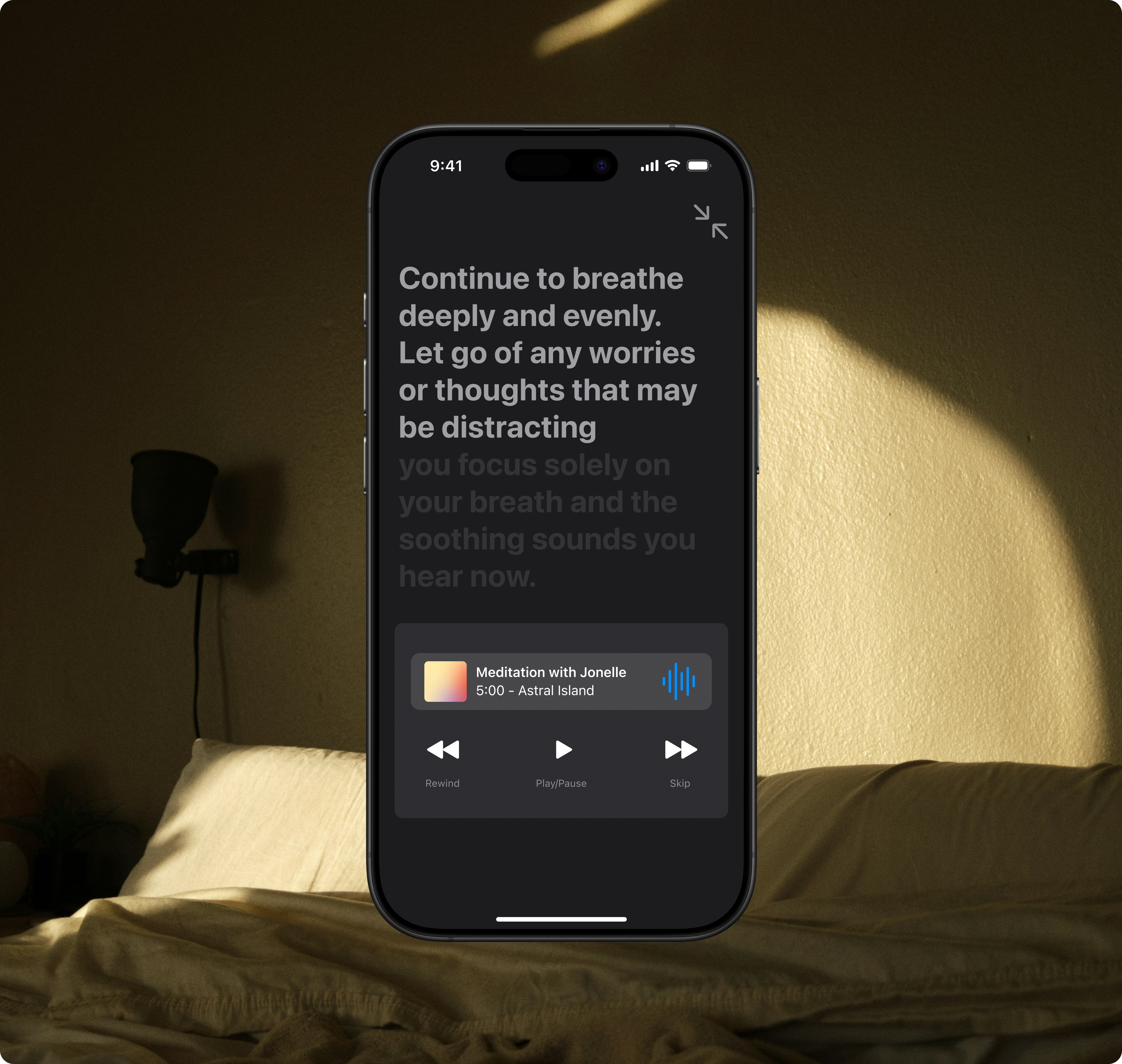
App Screens
Reflection/Takeaways
What Went Well
The careful selection of specific colours and typefaces can make the audience feel valued and confident in this proposal. These design elements not only contribute to its visual harmony but also help the audience trust the presentation’s professionalism, encouraging engagement.
What Could Improve
The presentation of some use cases could have been more effectively constructed. As I highlighted in my initial overview, sleep patterns can vary significantly from person to person. While I conducted a survey to gather insights, it became clear that individual preferences and habits deeply influence how people experience sleep. This variability underscores the need for a more nuanced approach in framing these use cases.
Disclaimer: The typeface, icons, colours, and terminology used in this personal creative project are intended for non-commercial purposes only. Any commercial use of these items may require a license from the third-party provider, Apple. Please consult the font licensing terms provided by Apple for further information.